


Have you ever noticed how some brands feel trustworthy while others feel playful or modern — without reading a single word?
That’s the power of typography in branding.
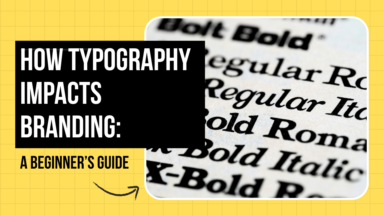
For beginners, typography may seem like simply choosing a font. In reality, it shapes how people feel about a brand, how easily messages are read, and how professional a business appears.
This guide explains why typography matters, common beginner mistakes, and how to use it effectively.
Common Typography Problems Beginners Face
Many beginners underestimate typography’s impact. Here are the most common issues:
Using Random Fonts
Choosing fonts without purpose weakens brand identity and creates inconsistency.
Poor Readability
Decorative fonts may look attractive but reduce clarity, especially on digital screens.
Using Too Many Fonts
Multiple fonts create visual confusion and make designs look unprofessional.
Ignoring Brand Personality
Fonts must reflect the brand’s tone and values. A mismatch damages credibility.
Recognizing these problems is the first step toward improving branding.
What Is Typography in Branding?
Typography in branding refers to the style, arrangement, and appearance of text used to represent a brand.
It includes:
- Font selection
- Spacing and alignment
- Font size and hierarchy
- Consistency across platforms
Good typography communicates clearly and leaves a lasting impression.
How Typography Shapes Brand Identity
Builds Brand Personality
Different font styles convey different emotions:
- Serif fonts feel traditional and trustworthy
- Sans-serif fonts feel modern and clean
- Script fonts feel elegant or creative
The right font instantly reflects brand values.
Improves Brand Recognition
Consistent typography helps customers recognize a brand across:
- Websites
- Advertisements
- Social media
- Packaging
Consistency builds familiarity.
Influences Customer Trust
Clear, readable typography creates professionalism.
Poor typography makes even strong content appear unreliable.
Basic Typography Rules for Beginners
Keep It Simple
Use one primary font and one secondary font.
Focus on Readability
Ensure text is readable on all devices and screen sizes.
Maintain Hierarchy
Use headings, subheadings, and body text properly to guide readers.
Stay Consistent
Use the same typography style across all branding materials.
Common Typography Mistakes to Avoid
- Overusing decorative fonts
- Ignoring spacing and alignment
- Mixing unrelated font styles
- Copying typography without understanding its purpose
Avoiding these mistakes improves brand perception immediately.
Tools to Practice Typography
Beginners can practice typography using:
- Adobe Illustrator
- Adobe InDesign
- Figma
- Google Fonts
These tools help designers experiment with font pairing, hierarchy, and layout.
Frequently Asked Questions (FAQs)
Is typography really important for branding?
Yes. Typography directly influences brand perception, recognition, and trust.
How many fonts should a brand use?
One or two fonts are usually enough for a strong, clean identity.
Can beginners learn typography easily?
Yes. Understanding the basics and practicing regularly builds confidence and skill.
Conclusion
Typography is more than just letters. It is a powerful branding tool.
By understanding how typography impacts branding, beginners can create designs that feel professional, clear, and memorable.
Start simple. Stay consistent. Let typography communicate your brand story effectively.
For aspiring designers in Ahmedabad, Gujarat, India, mastering typography is a foundational skill for strong branding and design careers.